‘Adman: Warhol Before Pop’: An Interesting Look at Warhol’s Early New York City Years
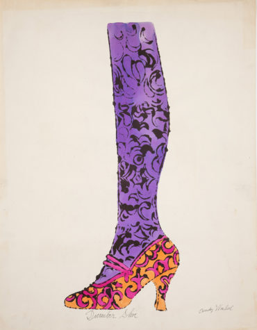
Offset lithograph and watercolor on paper. Andy Warhol, Shoe and Leg (“December Shoe”), ca. 1956, The Andy Warhol Museum, Pittsburgh, © The Andy Warhol Foundation for the Visual Arts, Inc.
Certain seedlings started to sprout in the mostly vanilla decade of the 1950s that would blossom and bear fruit in the mid-to-late 1960s. Some examples of that are: rock and roll, television, advertising, and consumer populism. Another example would be the art of Pittsburgh native Andy Warhol. The Andy Warhol Museum’s exhibit Adman: Warhol Before Pop, running through September 2, chronicles Warhol’s early work as a New York City commercial artist while also including some of his personal endeavors at the time. The time period covered is from 1949 through the mid Sixties.
Warhol grew up on Dawson Street in South Oakland. His beloved mother Julia, a folk artist in her own right, married Andrej Warhola in present-day Slovakia; he then immigrated to Pittsburgh and she joined him here in 1921. She always encouraged Andy in his artistic pursuits. He even took art classes at Carnegie Museum in Oakland.
Meteoric Rise
After graduating from Carnegie Institute of Technology (now Carnegie Mellon University) in 1949 with a bachelor of fine arts degree in pictorial design, Warhol and some of his classmates moved to New York City together.These early NYC years are documented in Adman through photos taken by friend and former classmate, Leila Davies Singelis. They show an energetic younger Warhol, plying his craft and having fun with friends.
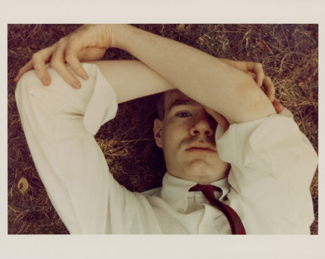
An early Andy Warhol “selfie.” Andy Warhol, Andy Warhol, 1950s, The Andy Warhol Museum, Pittsburgh, © The Andy Warhol Foundation for the Visual Arts, Inc.
There are several other interesting photos of him in the exhibit including a few early “selfies.” In many of the photos Warhol is partially hiding his face or posing dramatically; one is even a shot of him looking into a mirror. One photo of Warhol that really lines up nicely with the exhibit shows him sitting at his tilted art desk with the work light arm partially seen. In this photo he is looking directly at the camera in a relaxed, confident pose as if to say, I have fun with my art, but I take it seriously nonetheless.
Warhol’s first major NYC commission was for the September 1949 issue of Glamour magazine for the article, “Success Is a Job In New York.” By 1952, just a few years after moving to the Big Apple, he had a solid roster of clients. His work included magazine illustrations, album covers, fashion illustrations and advertisements, and department store window displays.
The period of 1953-1960 saw Warhol self-publish eight art books which contained cool illustrations and hand-lettered copy. Some of those on display at the exhibit are In the Bottom of My Garden, Wild Raspberries, and Horoscope for the Cocktail Hour.The latter featured Warhol-drawn signs of the zodiac with hand-lettered descriptions of people born under the sign and a matching astrological cocktail, including one called Aquarian Aromatic.
Warhol’s mother, Julia, often used her enchanting handwriting to pen the copy in Andy’s books and works. This began on one assignment as the deadline was fast approaching and Warhol pressed his mom into service to meet the deadline. The result was artistically pleasing to Warhol and others so she contributed to many more works
There’s a touching photo in the exhibit, taken by McKeesport, Pennsylvania native and noted photographer Duane Michals, of Andy and Julia. The 1958 photo has Julia in the foreground with a normal, composed look while Andy is in the background with a broad smile on his face.
Warhol’s rapid success gave him the income to hire an assistant to help him produce art and designs with his signature blotted line style. The early work is a forerunner of the silk screening work that would come later at his creative Factory.
Department Store Window Displays
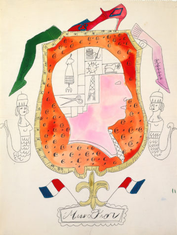
This sketch would become a storefront window display for Bonwit Teller. Ballpoint pen and watercolor on laid paper. Andy Warhol, “Miss Dior”, ca. 1955, The Andy Warhol Museum, Pittsburgh, © The Andy Warhol Foundation for the Visual Arts, Inc.
In high school Warhol had several summer jobs. One was as a fruit and vegetable huckster with a brother; another important early exposure for him was as a display department worker for Horne’s department store. That early experience in retail display would serve him well in his New York commercial art work of designing creative window displays for Bonwit Teller and others.
Several storefronts Warhol designed were recreated for Adman from the artist’s sketches. One was for Valentine’s Day 1955 with cupids, hearts, love messages, and smiling female faces. All components were in red against smoothly shined wooden planks with cutouts where fancy perfume bottles rested. Another was “Miss Dior” created in 1955 with a colorful, slightly avant-garde design. A third window display was beautifully elegant with a female mannequin who could have doubled for a dressed up Holly Golightly in Breakfast at Tiffany’s. Warhol even designed a store awning for the Fleming-Joffe leather goods store called “Snake Awakening” which featured friendly looking, pastel colored snakes.
Many aspiring artists who created department store window displays wouldn’t use their real names in regard to the work. They were afraid that retail work would damage their reputations as serious artists. Not Warhol, though, he embraced his commercial work, which provided a direct lineage to the more famous art and methods he would start employing in the Sixties.
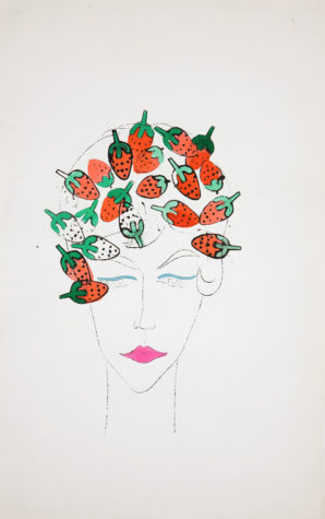
The Beatles could have written a song about this illustration of the girl with strawberry stamped hair. Andy Warhol, Woman (with Strawberry Stamps), 1950s, The Andy Warhol Museum, Pittsburgh, © The Andy Warhol Foundation for the Visual Arts, Inc.
An Adman on Adman
Warhol was also an amazing colorist and early evidence demonstrating that fact is on view, especially with the vibrant colors of “Shoe and Leg (“December Shoe”).” He was just as effective with lighter pastels, which he often used too. Warhol was well-known for his ladies’ shoe illustrations and this exhibit features many of them. He would often name the sketches after people, places, and events. One entitled “Merry Christmas” had the high-heeled shoe decorated with holly and red ribbons, and filled with colorful Christmas tree ornaments.
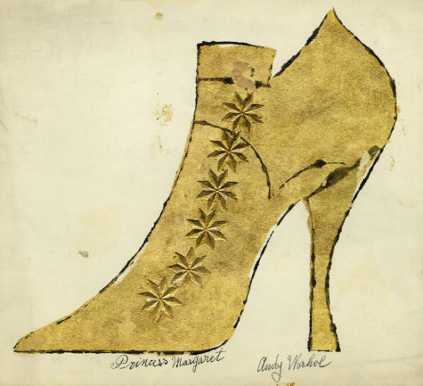
The ‘Adman’ exhibit contains many examples of Warhol’s shoe illustrations including this work on paper. Andy Warhol and Julia Warhola, “Princess Margaret”, ca. 1957, The Andy Warhol Museum, Pittsburgh, © The Andy Warhol Foundation for the Visual Arts, Inc.
As an Adman myself, I especially enjoyed the Warhol print ads that the exhibit showcases. One display shows the award-winning ads he had done for I. Miller shoes. There are actual full-page New York Times newspaper sheets with news articles, and some are society pages with announcements on them. What was really interesting was seeing Warhol’s fanciful shoe illustrations and ads almost leaping out of the relatively mundane newspaper content that surrounded them.
The ads are not copy heavy. They rely on eye-catching illustrations and simple, yet effective copy. One is a long vertical ad that starts about one-third of the way down the newspaper page. The ad is narrower at the top, which shows a woman’s leg, almost to the knee, and then toward the bottom the ad expands out horizontally for the foot which is wearing a fashionable I. Miller shoe.
To sell something one has to first garner the audience’s attention and then build a desire for the product. These ads do. Among the other whimsical I. Miller ads created by Warhol is one with a woman looking out from the page through glasses, and in the center of each lens is an image of an I. Miller shoe. Another has a woman lying horizontally gazing upwards while different shoes float above her head. The I. Miller ads can also be viewed on two notebook computer screens at each end of the display, allowing viewers to go through as many of the ads as they want. The series ran in the 1950s with many of the New York Times pages dated 1958-1959.
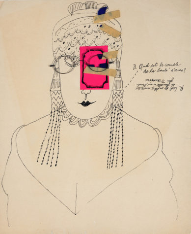
A mixed style works on paper. Andy Warhol, Demande Réponse, 1950s, The Andy Warhol Museum, Pittsburgh, © The Andy Warhol Foundation for the Visual Arts, Inc.
A different display shows a series of print ads Warhol did for Fleming-Joffe. One has two illustrations of an individual shoe. The first shoe is rather bland and uninspiring and the copy says “This is a shoe.” The second illustration shows a very fine and resplendent shoe with the copy, “This is a Fleming-Joffe shoe.” Another in that series uses the same method for a chair. These ads demonstrate that Warhol understood very well the concept of brand marketing or at the very least how to execute a brand marketing campaign. This knowledge was instrumental as his own brand continued to grow with Warhol cultivating its mystique.
Warhol could even dress up the normally pedestrian sale announcement. His block-lettered sale illustration for Fleming-Joffe has each letter containing funky flower designs and is done in ink and tempera on Strathmore paper.
One fun rough-style illustration that cuts to the root of all ads is an illustration of a man and a woman created with casein, wax crayon, and oil paint on linen. “Make him want you” screams the prominent copy headline.
Other Notes of Interest
Other interesting aspects of the Adman exhibit are sketches and memorabilia from a 1956 trip Warhol took to Asia. Displayed are sketches of fashions and other points of interest from Kyoto, Bali, and Angkor Wat.
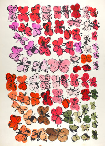
Butterflies are free to fly in this offset lithograph and watercolor on paper. Andy Warhol, Happy Butterfly Day, 1955, The Andy Warhol Museum, Pittsburgh, © The Andy Warhol Foundation for the Visual Arts, Inc.
A beautifully colored illustration of differently colored butterflies is called “Happy Butterfly Day,” and was done in 1955. Scenes of “Two Girls Laughing,” dressing screens, magazine illustrations, and entertainment industry work that Warhol created are also fun to see.
I had an opportunity to speak with Jessica Beck, The Warhol’s Milton Fine Curator of Art, after viewing the exhibit. When asked what her vision was for the Adman: Warhol Before Pop exhibit, the Washington County native generously gave praise to her predecessor in the role, Nicholas Chambers (now the senior curator, modern and contemporary international art at the Art Gallery of New South Wales in Sydney, Australia). Beck said “Chambers had done all the research for the exhibit and it first opened at the Gallery of New South Wales in 2017. What I tried to do was adapt the show so that it would be very approachable for the Pittsburgh audience.” She continued, “I was able to pull some items from our collection at The Warhol to add to the exhibit, including the screens.” When asked what one of her favorite aspects of the show is, Beck replied, “I liked the work done with Warhol’s drawing process of the 1950s. He would sometimes even trace photos”
I mentioned seeing quite a few cherubs in one of the displays and I asked her if they were especially popular during the period. She said that many graphic representations such as cherubs, flowers, fairies, and butterflies are symbols of the feminine domain and also queer references. She went on to say that Warhol would have coloring parties with his gay friends at Serendipity 3 restaurant in New York City.
Even if you’re someone who knows a lot about Warhol’s art there are many new insights into Andy Warhol and his work to be gleaned by examining his early career. Adman is an interesting and fun exhibit.
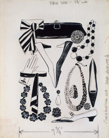
Warhol knew it was important to accessorize as seen in this ink on Strathmore paper illustration. Andy Warhol, Multiple Fashion Accessories, 1950s, The Andy Warhol Museum, Pittsburgh, © The Andy Warhol Foundation for the Visual Arts, Inc.
Adman: Warhol Before Pop continues at the Warhol Museum through September 2. The Warhol’s next exhibit is Devan Shimoyama: Cry, Baby which will mark the first museum solo exhibition for Shimoyama, a Philadelphia-born painter and professor at Carnegie Mellon University. It opens on October 13.
For more information visit The Warhol’s site or call (412) 237-8300. The Andy Warhol Museum is located at 117 Sandusky Street, North Side. Hours: Tuesday to Saturday 10 a.m. to 5 p.m. except for Fridays when the museum is open until 10 p.m. Closed Mondays.
Rick Handler is the executive producer of Entertainment Central.
Share on Social Media
Follow Entertainment Central
Latest Stories
Sign up for the EC Newsletter


